Unique web designs are an effective tool that can help you stand out from the crowd. But, when it comes to minimalism, it is a trend that sticks around. Minimalist UI Web designs are considered to be the most effective when compared to other Web designs.
These minimalist UI designs have become a popular choice, especially because of their clean and minimal look that’s easy on the eyes. Here are the benefits of minimalist UI Web designs to developing HTML templates.
1. Easy Navigation
Navigation is one of the essential features of a website because it allows visitors to find the information they are looking for quickly. The best navigation design is simple and easy to use, which makes it accessible to all users regardless of their technological skills.
Minimalist UI web designs provide a clear and straight-forward navigation structure that helps users easily find what they need. In addition to being easy to use, minimalist UI web designs also have a clear hierarchy and structure, which makes them a good choice for search engines like Google and Bing, which rely on user behavior when ranking content.
A minimalistic design also offers more space for content than traditional layouts, so you can include more relevant information about each page’s topic or product line.
Since there are fewer elements on a page, it’s easier for users to find what they’re looking for. A minimalist design style also allows designers to focus on one thing at a time, so they can create an experience that is clear and easy to use without distractions.
2. Faster Loading Times
Minimalist web design is known for its fast loading times. The way a website loads can be a big factor in whether or not people stay on your site and make a purchase. Minimalist web design takes away clutter, leaving only the essential elements of the page. This allows for faster loading times and fewer page refreshes, which are key to keeping visitors on your site longer.
It’s also a refreshing change from the usually cluttered interfaces. It makes your website more attractive and faster to load. When you have a large amount of content on a single page, it takes time for the browser to fetch all the content before rendering. If you use an extensive CSS framework or other heavy assets, then it will add up to the loading time of your site. A good example of this problem is an old website which used to take almost 2 mins to load on desktop browsers.
Minimalist UI web design usually solves this issue by focusing more on visual elements than code and assets. This reduces the overall weight of your website and makes it faster to load because there are fewer resources being loaded at once.

3. SEO Friendly
When you design a website, one of the most important things to consider is the search engine optimization. The best way to do this is by using a minimalist UI Web design style, Which will make your website’s content easy to find through search engines like Google.
Minimalist UIs are also crucial for SEO because they’re less distracting for users scrolling through long pages. This means that visitors will be more likely to stay on your site longer and read through your content instead of clicking away from it immediately after seeing an image or button on the page.
Also, these websites are SEO-friendly because they don’t have too many images and other elements to be indexed by search engines. This helps to improve your website’s ranking on search engines like Google, Bing, Yahoo, etc. Minimalist UI helps in creating a better user experience for users and also increases your website’s ranking on search engines.
4. Fewer Problems
Minimalist UI design is not just about making things less cluttered. It’s also about eliminating problems. Without the extra clutter, your users don’t have to worry about accidentally clicking on something they shouldn’t and losing data. This makes desktop and mobile web apps more trustworthy as well as easier to use.
5. Better User Experience
The less information a user has to work with, the better the experience will be for them. A minimalist UI design puts all the important information in one place where users can find it quickly and easily without having to think about what they’re looking for or where it might be on the screen.
Why Should You Go With Minimalist UI Designs?
Absolutely yes, with a minimal UI kit. Going with a minimal UI kit will help you get started on your journey of creating a beautiful website or app design. And even if you’re not ready to dive into full-blown minimalism at this point, it’s always good to have options when building out your own personal brand.
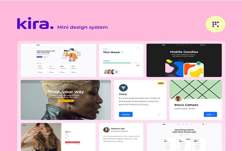
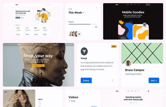
Kira – Mini Design System is an Affordable minimal design system for Sketch and Figma in the market. It is the best minimalist design template that an expert UI designer has designed. Its built-in features are very helpful for designers and developers.
Kira is a collection of icons, UI elements, and layouts that can be used to create interfaces in Sketch and Figma. The UI kit includes 300+ unique symbols and components. You can use these assets to build your next project easily.
Here are some benefits of using Kira:
1) Good Design UI kit
2) Easy to use UI Kits
3) Full Web Design styles with color schemes
4) Free Lifetime Updates
In Conclusion…
If you want to build a design system that’s not only a quicker process but won’t also cost an arm and a leg, then consider minimalist UI kits. There are many benefits to using a simple minimalist design, as discussed above, as it allows for easy customization, it is easy to learn and use, and many more. Of course, it all depends on what your needs are for your website or app.
Author Bio – Ronik Patel is the CEO & Founder of Fabrx Design & UnlimitedWP, A White Label WordPress Development Agency located in Boston, USA. Offering Unlimited WordPress tasks for digital and web agencies at a fixed monthly cost.
Follow – https://techhipo.com for More Updates


